
WACH Sicherheit: A Strong Identity Built Around Protection and Trust
-
Client’s Request: WACH Sicherheit, a professional security services company in Germany, needed a distinctive visual identity that would immediately communicate protection, vigilance, reliability, and professionalism. The brand had to work confidently across a wide range of applications—from security uniforms and company vehicles to signage, business stationery, access cards, and digital platforms.
-
Our Initial Inspiration and Ideas: Our concept began with the very essence of security: staying alert, protecting what matters, and creating a sense of confidence. The wolf became the central symbol of the identity—an animal associated with vigilance, strength, intelligence, and instinctive protection. We integrated it into a shield to create a compact emblem that combines watchfulness with defense, while giving WACH Sicherheit a recognizable and authoritative visual presence.
-
How We Approached It: We developed the identity around a balance of strength and professionalism rather than aggression. The angular construction of the wolf creates movement and alertness, while the shield provides stability and a clear sense of protection. A classic serif typeface was selected for the WACH wordmark to reinforce credibility and permanence, complemented by the more refined “Sicherheit” typography. Together, the elements create an identity that feels established, confident, and suitable for a professional security company.
-
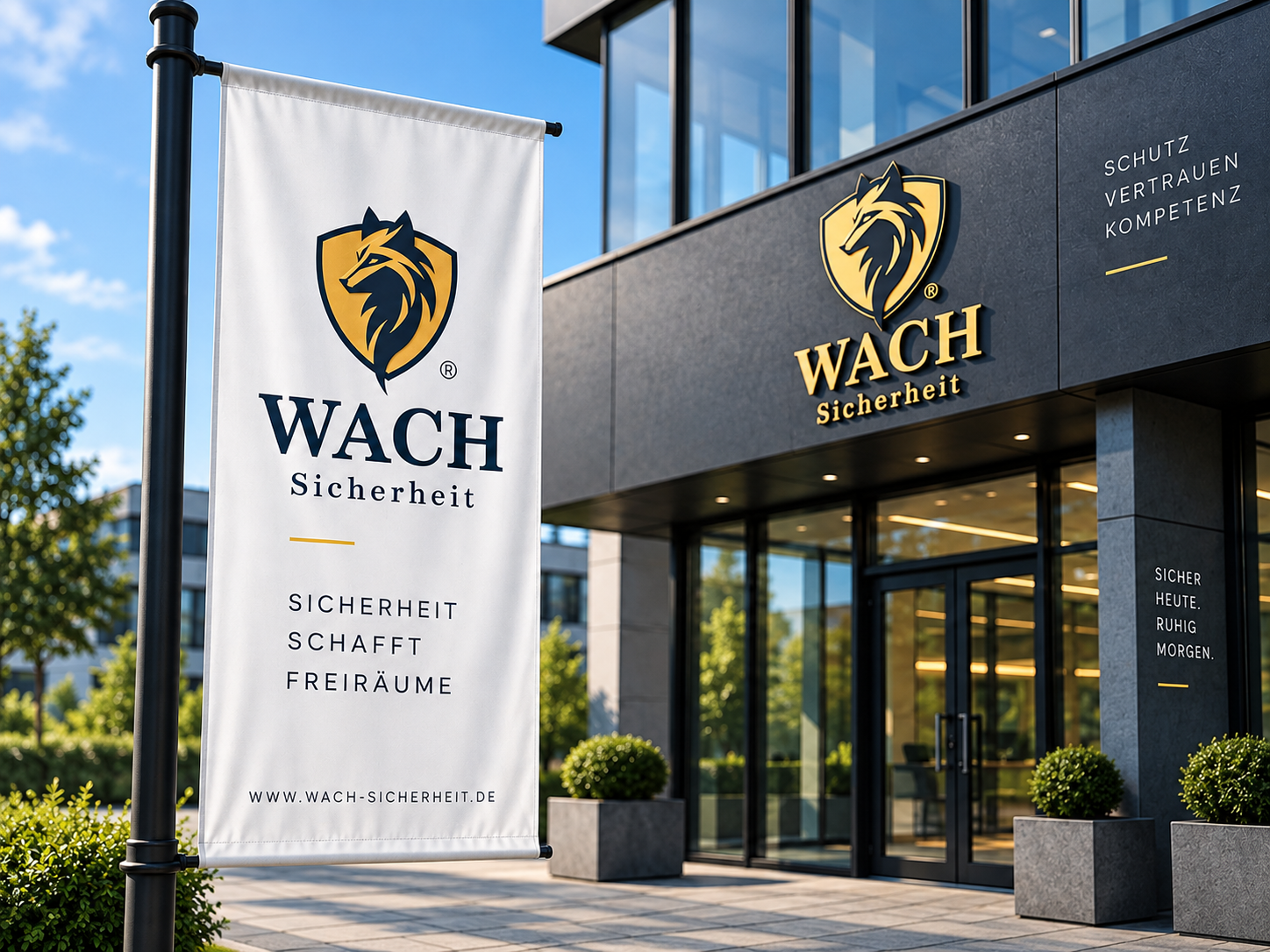
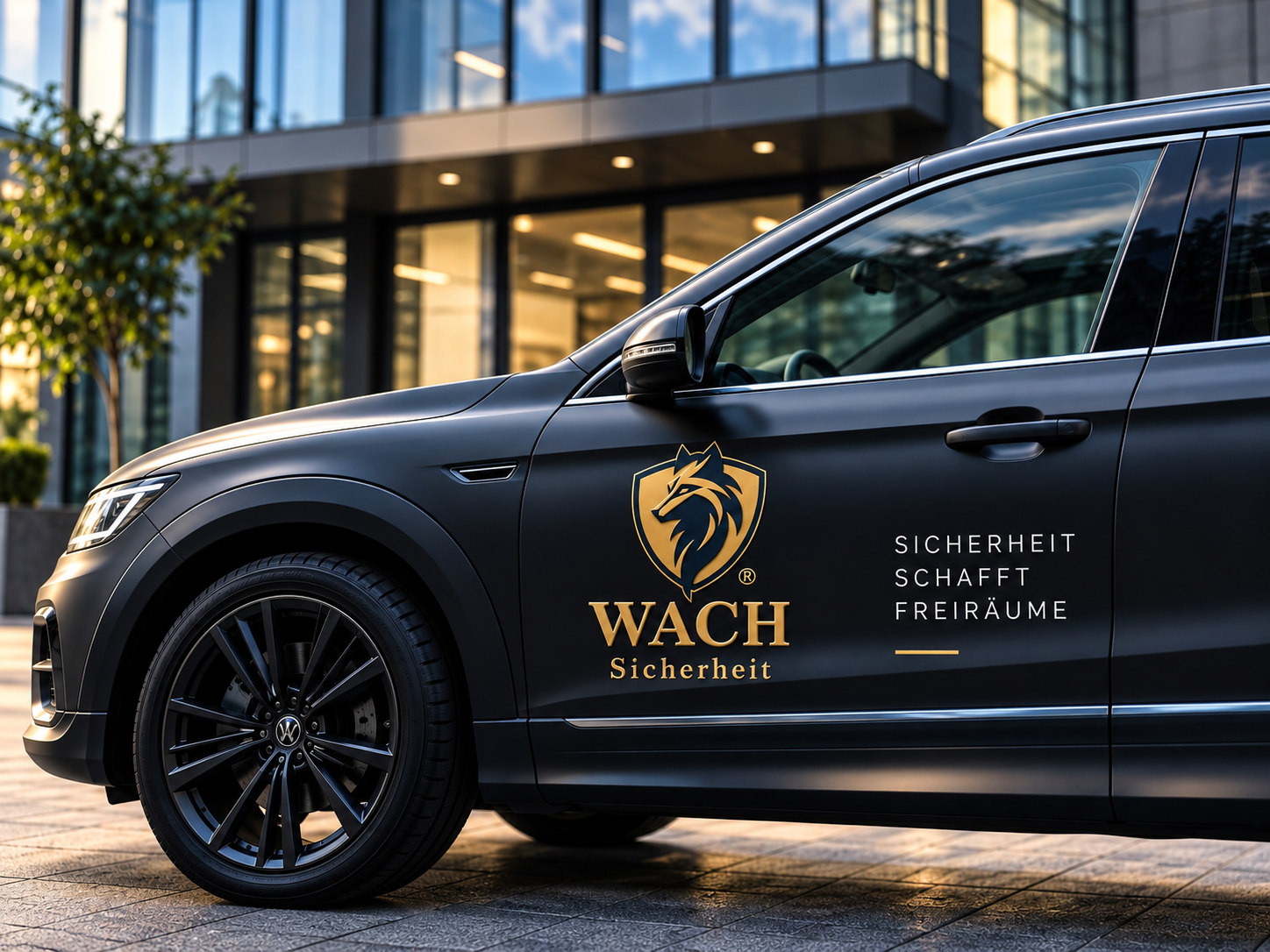
Colors We Used: The color palette combines deep navy with a warm gold tone. Navy communicates trust, discipline, stability, and professionalism, while gold adds authority, quality, and distinction. The combination also gives the identity excellent visibility on dark uniforms and vehicles while allowing it to maintain an elegant corporate appearance on light backgrounds and printed materials.
-
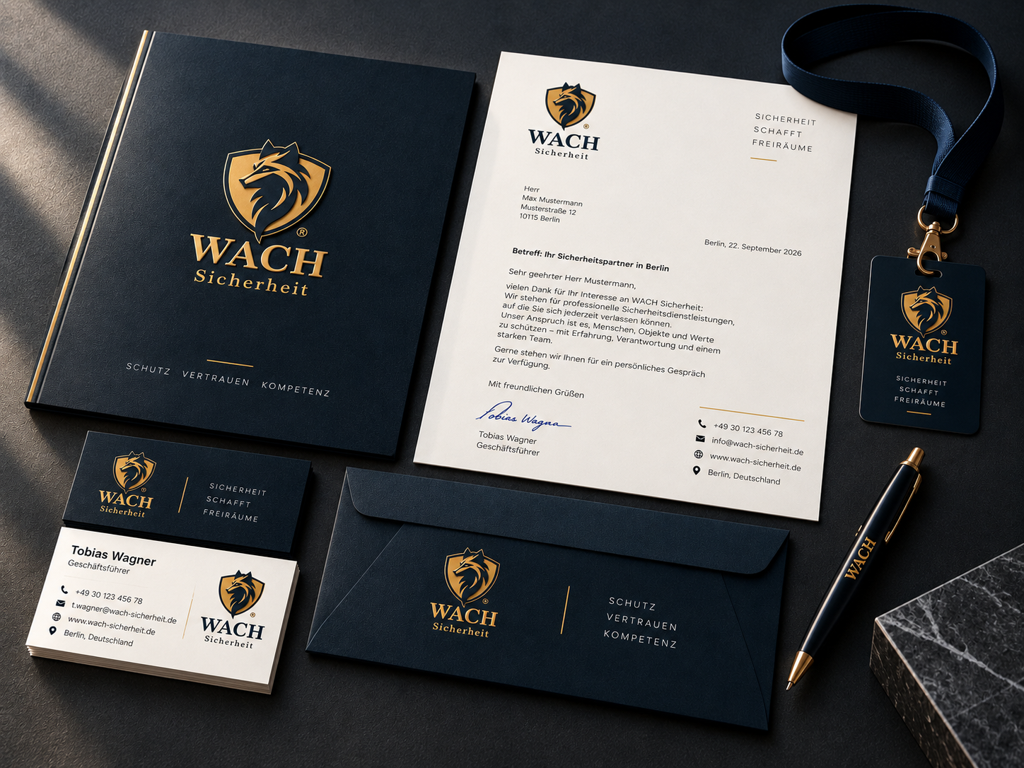
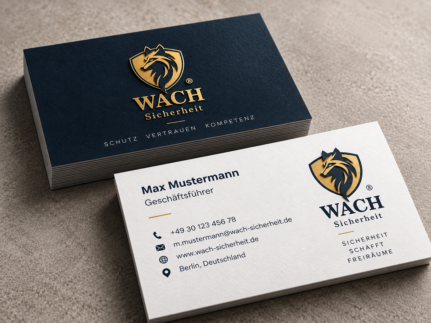
Fulfillment of the Client’s Business Needs: The WACH Sicherheit identity was designed as a flexible visual system rather than simply a logo. The shield can function independently as a recognizable brand mark, while the complete signature provides a strong corporate presence. This flexibility allows the identity to remain consistent across security vehicles, employee uniforms, ID cards, flags, exterior signage, stationery, and digital applications.
-
Audience Connection: The identity speaks directly to clients looking for a security partner they can trust with people, property, and valuable assets. Its visual language communicates vigilance without intimidation and strength without unnecessary aggression. From the first impression, WACH Sicherheit presents itself as a professional security brand built around three essential values: protection, trust, and competence.
